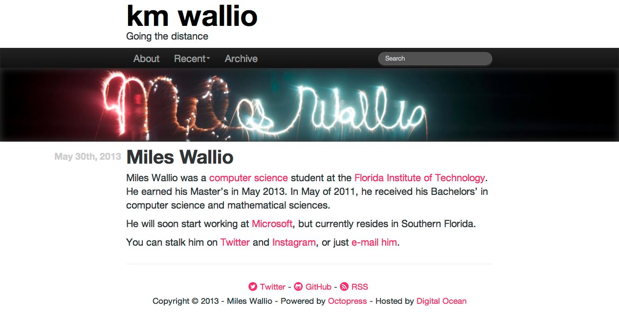
I hope things look nice and fresh and so clean clean around here1. I was trying to come up with something that looked modern and promoted readability. The goal with the home page was to have something that looked like the center column of a newspaper–headers and images to catch your attention. Individual posts are like the rest of the story, focus is on the text.
Not that the default Octopress theme is bad, it’s just bulky. I knew I wanted to redesign my blog, but I didn’t know what I wanted it to look like. I looked at the blogs I enjoy reading, like Shawn Blanc, Daring Fireball, Zach Holman, Matt Gemmell, and many others. Matt Gemmell recently wrote on blog design and made several good points.
It made me think, which blogs do I read on their site, and which ones do I read in my RSS reader? The list shrunk rather quickly. My RSS reader is subscribed to about 80 sites. Site I go to instead of reading from my RSS feed are the GitHub Blog, Shawn Blanc, Panic Blog, John August, and Zach Holman (sorry Matt).
But what made me prefer them over my RSS reader?
Identifying my preferences
If you look at the GitHub Blog and Shawn Blanc (and John August’s depending on the size of my browser window) compared to the rest of the links I provided, you’ll notice that the content is not positioned center. They do use a dark font on a light background. I’m also subscribed to prolost, but I read it in my RSS feed. It uses dark text on a dark background, and if I look at the center of the page, I’m looking at a gap. Content is not the focus.
When looking at my own blog, I noticed the surroundings were really dark, almost gloomy. It shocked me when I realized how looking at my own site made me feel. It was dreary. I never really caught it because the editor I use is bright and elegant feeling. They syntax highlighting I use is even brighter. So I like reading content on pages that are clear and contain bright contrasting colors.
Panic, Zach Holman, and sometimes John August have their content dead center. The content is also mostly black on white.
Next step
I noticed my preferences leaned towards the designs where content was centered, and the text was black on white.
Articles were also more enjoyable to read when there wasn’t a side bar. It let me focus on one thing. Serif fonts were out, probably because of a traumatized childhood involving Times New Roman, but that’s another story.
Cool, I knew what I liked and drafted a plan:
- Centered content
- Minimal navigation at the top and bottom of the page
- Bright color somewhere
- Incorporate photos better somehow
- Try to take Matt’s advice
Putting all of those things together, this is what I came up with.

Pretty snazzy, right?
Before I continue, let me give some credit to where it’s due. The design is heavily influenced by Zach Holman’s blog, medium and Matt Gammell’s blog. If those two sites and Bootstrap had a baby who liked sites with a hint of pink, it would probably look like my new design.
Hopes for this new design
Like I said earlier, I wanted it to contain the essence of a news paper–but modern. After playing with Bootstrap for one of my side projects, I decided I liked the typography and features the framework provided. It’s also clean cut by default. I enjoy the way articles look now, and I hope you do too.
I wanted to remove the doom and gloom feeling I got from looking at my blog. So I stripped out most of the dark colors. Originally, I thought blues and grays for headers and background would bring attention to content, but it really just made it look like my content wandered into the bad section of the neighborhood.
To assist with that, I also changed the syntax highlighting. I know a lot of people love solarized. I did, but now it either makes me feel gloomy or like I’m trapped in a desert. So now source code looks like this:
ruby Discover if a number is prime http://www.noulakaz.net/weblog/2007/03/18/a-regular-expression-to-check-for-prime-numbers/ Source Article
class Fixnum
  def prime?
    ('1' * self) !~ /^1?$|^(11+?)\1+$/
  end
end
I probably have to pick something other than green for strings, but we’re getting better. Doesn’t the code look happy?
I hope you enjoy the new design.
Credits
- Social Icons from Mono Social Icons font
- CSS and JavaScript framework from Bootstrap
- Tips used from Matt Gemmell
- Heavy inspiration from medium and Zach Holman
- Still powered by Octopress